In which our Hero (ahem) seeks out the work of earlier giants, absorbs mentorship, tries and fails, learns that obvious things are obvious even to him (after failing), and muses on the proper order of tasks…
So, learning to print…
It’s a big topic. Here’s how I’m doing it.
First, obviously, I bought a printer. You can find that event in a previous post, already linked above.
Second, I started reading. The second link, above, is an example of the kind of web search I’m doing, although they are getting more and more specific as time goes on. I also bought a bunch of books. Among them are:
- Jeff Schewe‘s Digital Print and Digital Negative;
- Guy Tal’s More than a Rock;
- Robin Whalley’s Photographers Guide to Image Sharpening and Perfect Prints Every Time;
- Fine Art Printing for Photographers by Uwe Steinmueller and Juergen Gulbins;
- Tom Ashe’s Color Management & Quality Output;
- and more…
I haven’t read them all — hell, I haven’t even cracked them all. You will notice that I prefer ebooks. They have less mass and volume than physical books.
Third, I started printing. A manager of mine once said “you don’t have time to make all the mistakes other people have made”, so I gather other people’s stories in order to make my own. But in order to make my own, I’ve gotta actually try doing it.
Case in point: I’m starting with mostly black and white printing. Not because it’s easier but because I’m exploring my monochrome side :-). I’ve got a variety of papers and a variety of images, I’m trying workflow improvements in Lightroom, testing control surfaces and keyboard overlays, adding color management (because when the images are only appearing on my displays, color is what I say it is, so why manage it?), and so on. Eventually I observe that my sample prints are consistently far warmer (brownish, basically) than what I see I on the screen. I can hold a print up to the screen and see the difference. I find several different ways (eight? nine?) to characterize color management through the workflow path, using Lightroom, Photoshop, ColorSync, and multiple third party solutions. I try them all. I re-calibrate my monitors (3 of them!) and my printer. I improve my physical set up so that I have allegedly D65 lighting above the printer. I add an allegedly D65 task lamp to my desk.
And that is the magic. Seen under the task lamp, images match the screen. Seen under the overhead LED bulbs in my track lighting, images are warmer.
Lessons learned:
- Paper alters the visual appearance of a print (duh — but while I had considered surface reflectance and texture, I hadn’t really grokked that white paper has a color — because I’m an idiot);
- Viewing light alters the visual appearance of a print (again, duh — but I understand that in my gut now);
- Perfection is a rathole — I spent days researching, experimenting, and tracking this down. The paragraph above does not do justice to the amount of work involved. I have a new understanding that, while I have lighting in place above my printer and on my desk that is allegedly D65, I am not yet prepared to create spaces and spend money to virtually guarantee consistency of lighting in creating and viewing prints, nor am I yet knowledgable enough to select which of several possible standards (D50, D65) I should choose; so…
- For now, good enough will have to do.
The number of details is overwhelming. I have white cotton gloves to handle paper before it’s used (to avoid getting skin oils on it, which may damage the print). I have sticky notes all over one screen detailing my current (and some previous) procedures to go from (notionally) final image in Lightroom to image on paper. I am in the process of creating somewhere between 12 and 30 proof copies of the same black and white image for paper tests. And I will do the same for at least one color image (probably more — a set of color charts won’t suit me in this, so I will probably print images with several color sets). Those proof prints will have to be protected and stored, because while I expect to settle on a couple of paper types for common use, there will undoubtedly be images I want to treat specially in the future, and I don’t want to do sets of tens of proofs over again if I can help it.
Why am I in such a hurry to pick a paper? Because a friend has indicated he would like a print (actually, he offered to buy it, but I’m giving it to him) and I don’t want to lose this opportunity to share my art with someone else. But I’m geeky enough to want to get it right. And there is no management chain standing over me telling me how I have to do something, or setting a schedule. I’m eager to get it done, but I want it right before I release it :-).
Soft Proofing for Printing
A huge element of this process is going from (allegedly) final image to print. Working the image is a whole thing in itself (and I’m working hard on that too) but going from image to print is a new thing, not an adjustment of an existing thing.
I work in Lightroom wherever possible to do what I want. In this case, that means I’m working in the Develop module, I’m using Before/After Left/Right Split as my View mode (I set it in the toolbar at the lower left corner of the working window), checking Soft Proofing (also down in the tool bar), and make sure the Before image is the “Master Photo”.
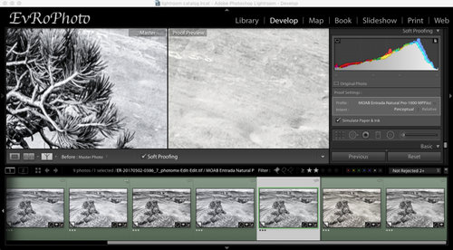
First thing to do is make a Proof Copy and select the paper’s ICC profile in the “HIstogram/Soft Proofing” panel of the Develop module. I see whether Perceptual or Relative intent better serves my purposes (almost always, for now, I’m ending up with Perceptual) and check what Schewe calls the “look like crap” box — the “Simulate Paper & Ink” checkbox. Then zoom to 100%
Why do I check that box? There are places on the web suggesting you not bother, because Soft Proofing in Lightroom “overdoes” the loss of contrast moving to a print. Yeah, that’s true, and I often find myself looking at the difference between original black and simulated on-paper black and trying to figure out a way to make on-paper black blacker. But I can’t. But the simulation gives a decent look at the overall color cast of the paper, which matters a LOT to me, relatively speaking. The difference between white white and warm white (or cold white) in a black and white print is something I want to see.
Generally I find that relatively minor Basic adjustments are all I’m doing here. Maybe up to 0.3 exposure change, less than 10 Temp change. Sometimes a bit of Contrast. Schewe advocates a bit of Clarity to boost the lost contrast, but I’m not there yet.
When I’m satisfied, I jump over to the Print module. From there, I check the Page Setup… to make sure the Paper Size is correct. When I have more than one printer, I imagine I’ll be checking which printer I’m talking to, too. If I haven’t changed anything, I’m careful to hit the Cancel button because sometimes the OK button makes my panels go away. No, I don’t know why. I just avoid it if possible.
Printing via Lightroom Print module
From top to bottom, I make sure:
- I’m on Single Image;
- Rotate to Fit is checked;
- Margins are 0.25″ each;
- Cell Size is appropriate for page size;
- all Guides are shown.
Print Resolution gets unchecked momentarily to check the actual print PPI (upper left corner of the image, but it only appears when Print Resolution is unchecked). Since I’m working on a Canon printer, I want my resolution to be a multiple of 300. If the resolution is between 300 and 600, I set it to 600. I haven’t gone higher than that yet. Then make sure Print Resolution is checked so that Lightroom will resize the image to a multiple of the printer’s native resolution. If it were an Epson, it would be 360 (720) instead. I should note that Schewe says this is only necessary when working with high-gloss paper and not when dealing with “watercolor” papers. I infer that smooth surfaced papers are more likely to show a difference here, but don’t worry too much about doing the upsampling when unnecessary. It’s just CPU cycles and RAM, and I’ve got enough of both. When the new iMac Pro or Mac Pro gets bought, I’ll have even more :-).
Print Sharpening gets set according to what I’ve done to the image before calling it a master. If I did no sharpening, I set it to High. If I did capture sharpening, I set it to Standard. I haven’t set to Low yet because I trust Lightroom to do my target sharpening for me (so far).
Media type is set to Gloss or Matte as appropriate. I call Satine or semi-gloss glossy.
Make sure the profile is set correctly (why doesn’t Lightroom make this profile match the soft proof profile if present? I don’t know, but it should). Check the Intent (ditto).
Now the Printer… dialog. If I’m working off a commonly used paper, I have a preset. If not, I start with defaults and check to make sure that:
- Color Matching is disabled and set to ColorSync;
- Paper Handling does NOT have “Scale to fit paper size” checked and that Destination Paper Size is correct;
- Quality & Media has the right Media Type and the right Paper Source. I rarely play with Print Quality so far, and am not yet testing the Black & White Photo Print mode;
- Paper Detailed Settings has “Cancel Margin Regulation” checked in case I’m doing borderless printing or, really, just to make sure I’m in control of the margins.
At some point, I may set color options for one or more papers, in which case there will be more saved presets, but I haven’t seen any reason to do this yet.
Hit the “Print” button in the dialog, and wait…
After Printing
It doesn’t really take that long to do a print. But a print should be let sit for minutes to hours after the ink hits the paper. ColorMunki software says a minimum of ten minutes for color to stabilize. Schewe’s Digital Print notes that prints are susceptible to scratching for several hours and to avoid stacking prints without interleaf sheets and further advocates waiting 24-36 hours before framing to allow ink to outgas. Since I am doing test prints right now, this isn’t really relevant to me. If I scratch a print I just have to compare it somewhere it’s not scratched. When I am doing production prints I will search out a source for interleaf sheets and use them.
Many of my prints go upstairs and get put on a table in the living room that gets lots of natural light in order to see them in an alternative viewing setting. It also gives my wife a chance to peek at them and point out problems she sees that I do not. My color discrimination is not great, so it’s nice to have someone else take a look at them.
And there it is. The current Testing process.
(Originally posted to my personal blog @ Mischievous Ramblings II)